synergyflow.ai
✨ Now powered by AI
Empower Your Workflow
With AI-Powered Solutions
With AI-Powered Solutions
Unlock seamless productivity and supercharge your team with our cutting-edge platform.
Get Started FreeBook a Demo
Purple gradient. Floating glass cards. “Empower your workflow with AI-powered solutions.” Your generator gave every founder the same page. We rebuild it as something only your company could have made.
A generated page fails in five predictable ways. If three of these describe your analytics, the design is the cause, not the channel.
The first screen answers a question nobody arrived with. There is no product, no price, no proof — only a claim that could belong to anyone. Recognition takes about a second, and the tab closes.
One call to action, repeated four times, surrounded by decoration. No comparison, no specification, no screenshot worth studying. There is no second thing to do, so nobody does a second thing.
These pages ship as an empty shell with the copy painted in by JavaScript. Crawlers index a loading state. Worse, the sentences that do get indexed are the same sentences on ten thousand other generated pages — nothing to rank on.
“Trusted by 10,000+ teams”, five grey rectangles where logos should be, five stars from Sarah J. A buyer who cannot verify one claim discounts all of them, including the true ones.
Nothing about the page is attached to your company. No one screenshots it, quotes it, or sends it to a colleague. The page cannot be recalled a day later, which means it cannot be recommended.
Live, not a screenshot. Every trope in one artefact: the gradient, the glow, the invented testimonials, the stock strangers, the acres of nothing. Turn the tells on and it labels itself.
Nothing above is exaggerated. Every element is lifted from pages currently in production, shipped by companies with real products and real customers hidden somewhere behind all of it.
Six structural reads, not vibes: where your alignment axes fall, how many rungs your type scale actually has, whether your cards repeat around nothing, how many text rows fail WCAG AA, how much of the frame is a gradient — and yes, how purple it is. Nothing leaves your browser.
Drop a screenshot on the plate and the needle moves. Scoring runs on your machine — nothing is uploaded, stored or sent anywhere.
Indigo-to-purple is the single most predictive colour on the internet right now, and nobody chose it. It is #6366F1 — the default accent shipped with the CSS framework most AI assistants were trained on — sitting next to the violet that image models inherited from a decade of SaaS marketing art. Ask any generator for “modern, premium, tech” and it reaches for the same 76° of hue, because that is what the words meant in its training data. So it is not that purple is bad. It is that a page arrives at purple by not deciding, and every visitor has already seen forty pages that did the same.
What this scan cannot see: your words. Buzzword density and claim specificity are the loudest tells of all, and they need the text, not the pixels.
None of these are style. They are decisions a model cannot make for you, because they require knowing what your business actually is.
Replace the abstraction with the sentence you would use on a call. “Push notifications that arrive on both platforms” beats “empowering seamless engagement” every time.
One paper, one ink, one accent. A flat surface forces the layout to carry the page, which is exactly the work a gradient was hiding.
Blurred translucent cards exist because nobody had a product shot ready. A cropped, honest screenshot of the real thing outperforms any abstraction.
One display face, one working face, four sizes. If everything is 16px semibold with generous line height, nothing is being emphasised.
Motion should reveal structure — an ornament drawing itself, a card leaving the stack. Fifty fade-ups on scroll is not motion design, it is a plugin.
Named clients, a number you can defend, a photograph of the team. Generated pages cannot produce these, which is why they resort to “10,000+ teams”.
Four we designed and shipped. Cover the logo on any of them and you would still know which business it is.

A temple-flower recycling story told as craft, not as a health-tech pitch. Warm paper, botanical detail, product photography carrying the page.
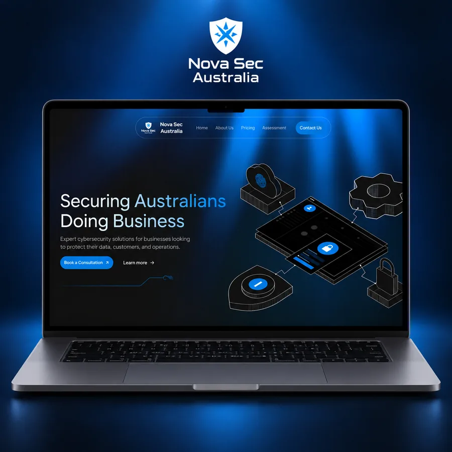
Security buyers read specifications, not adjectives. A dense, technical layout with real architecture diagrams and no stock padlock in sight.

Vehicle-first, spec-forward pages for an EV line-up. Configurators and range figures placed where a buyer actually looks for them.
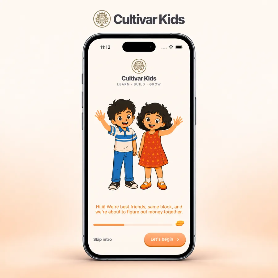
Land and community sold through maps, plot data and site imagery — the information a serious buyer needs, laid out without any gloss.
You get a short written teardown: what reads as generated, what is costing you trust, and the three changes worth making first. No deck, no pitch.